(COPY)

Annual Conference and Exhibitions brand guidelines 2023

Bringing the people profession together
8-9 November 2023, Manchester
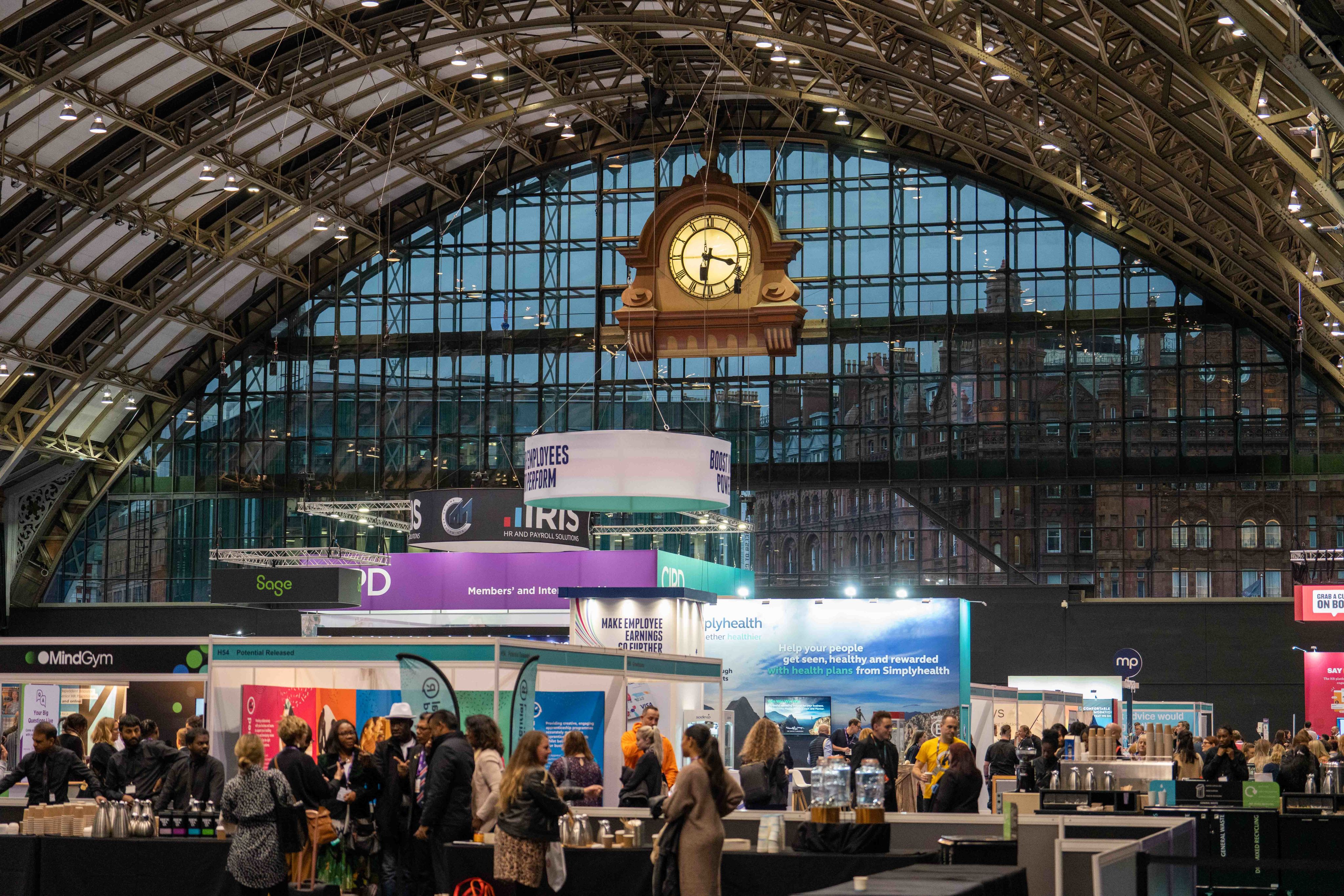
The CIPD Annual Conference and Exhibition is the flagship event serving the heartland of the people profession, providing delegates with the opportunity to reconnect with a global community of people professionals and rebuild a better future for people in the workplace.
This year’s event will be in an engaging hybrid format, offering you additional opportunities to reach and engage with purchasing decision makers from across the world.
The event is held at Manchester Central on the 8-9 November 2023
Master logo
Logo use and smallest ideal sizings

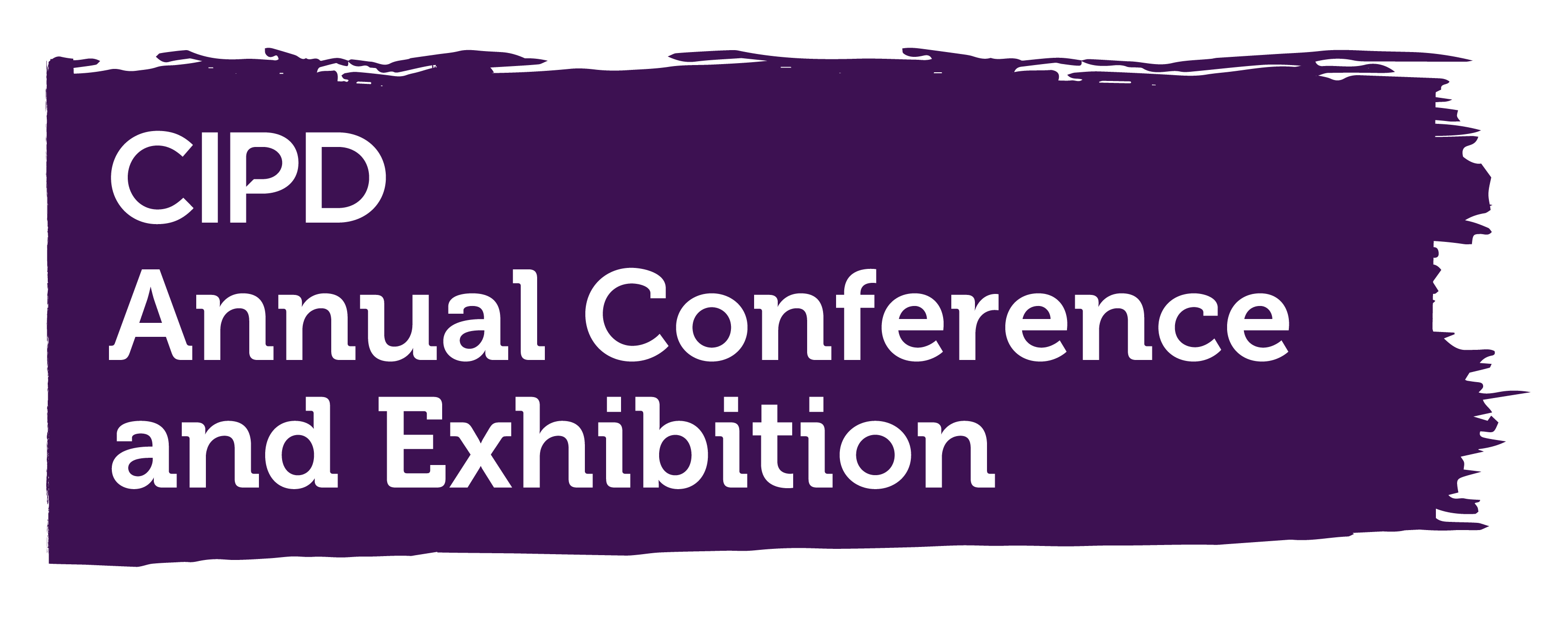
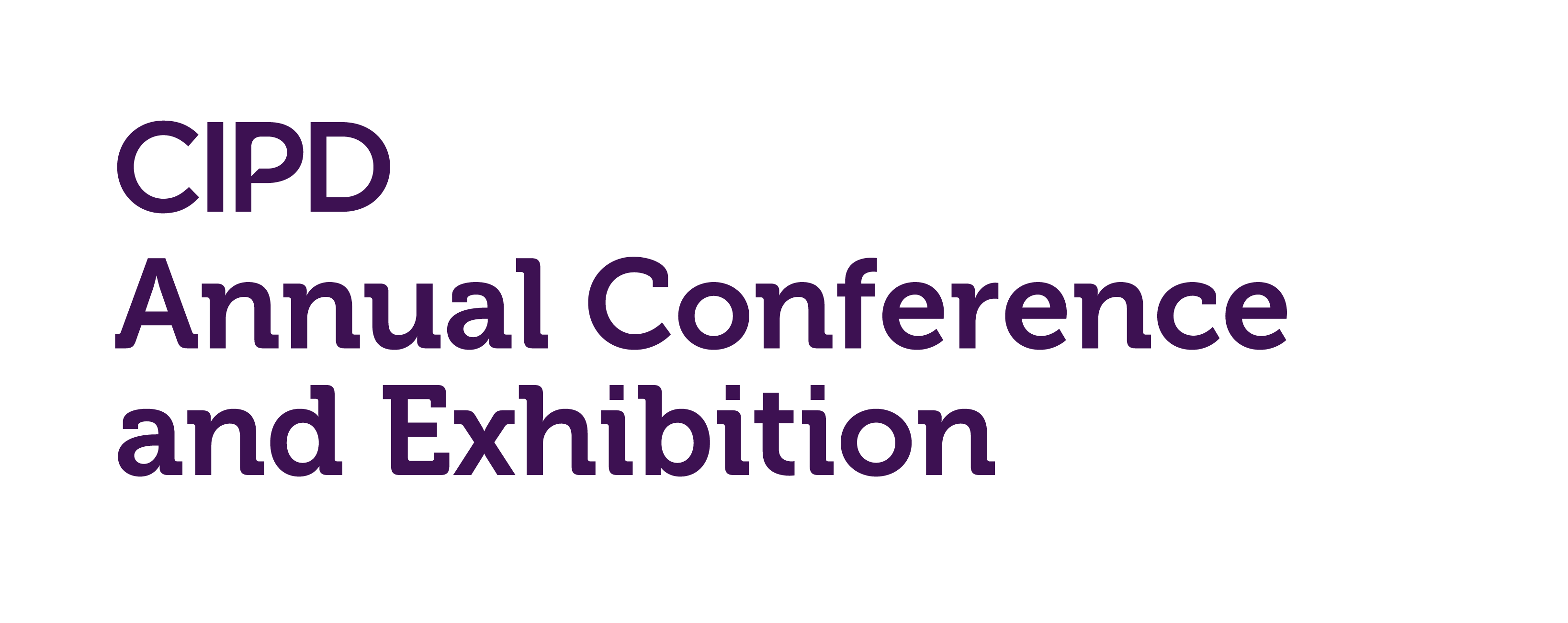
Annual Conference and Exhibition master logo
The master logo should never be used any smaller than 12mm for print and 34px for digital. Some of the only scenarios where it may be used at this size are social media avatar on mobile or on the side of a pen.
When using ‘A’ sizes in print please use the measurements listed on this page. For digital applications, please use the closest A size equivalent.
- A3 | 142px/ 50mm
- A4 | 113px/ 40mm
- A5 | 85px / 30mm
- A6 | < 34px / 12mm

White logo
White logo is to to be used on the darker CIPD background colours
Typography
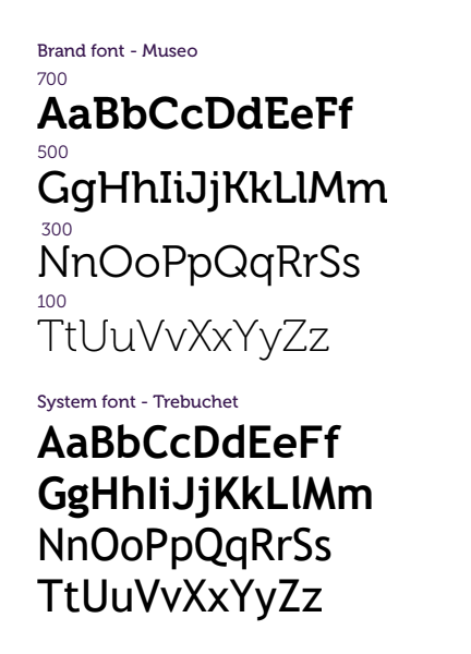
Primary brand font
Our brand font is Museo it has been selected for its contemporary elegance and clarity. Museo comes in a number of weights so it can be used in headline messaging through to body copy.
Our system font is Trebuchet, this will be used in Microsoft Office programmes where Museo is not available.
Museo can be activated through Adobe fonts
https://fonts.adobe.com/fonts/museo
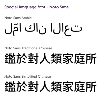
Other languages
Other languages
For other languages we use Noto Sans which is very flexible and comes in many different language formats.


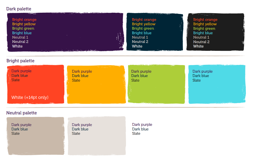
Colours and textures
Annual Conference and Exhibition colours and accessible usage


Using colours together
Colours should partner colours as
Purple & light blues
Dark blue & green
Orange & Dark blue
Dark palette
Dark purple is our primary colour in the dark palette and is used within our master logo and purpose strapline. The dark palette is used to create clarity when used as type or as a backdrop to enable our bright colours to really sing. Dark blue and slate are our secondary dark colours so should be used less than dark purple, but they add variety when needed.
Bright palette
Adds dynamism and energy.
Neutral palette
Adds sophistication and creates breathing space when the bright palette is being used extensively.


Dark purple
CMYK 80//97/0/45
RGB 61/17/82
Hex #3d1152
Pantone 669 C


Dark blue
CMYK 100//19/10/72
RGB 0/41/62
Hex #00293e
Pantone 3035 C

Slate
CMYK 75/65/60/80
RGB 32/32/32
Hex #202020
Pantone 426 C


Bright orange
CMYK 0/79/82/0
RGB 255/78/39
Hex #ff4e27
Pantone 1665 C


Bright green
CMYK 37/0/85/0
RGB 182/212/65
Hex #b6d441
Pantone 2290 C


Bright blue
CMYK 56/0/16/0
RGB 88/223/234
Hex #58dfea
Pantone 2985C


Neutral 1
CMYK 21/22/28/3
RGB 207/193/180
Hex #cfc1b4
Pantone Warm grey 2


Neutral 2
CMYK 10/9/12/0
RGB 234/229/224
Hex #eae5e0
Pantone Cool Grey 1


White
CMYK 0/0/0/0
RGB 0/0/0
Hex #ffffffff

Accessible usage for brand colour palette
Accessible usage for brand colour palette
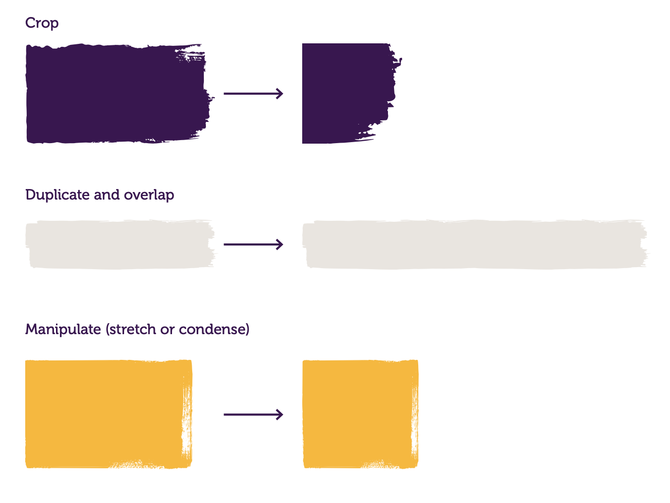
Use of brush stroke graphics
We use brush stroke graphics throughout our communications to add a human element, and a flexible distinctive style that will be recognisable as CIPD. When stretching a shape, take care to ensure it does not lose it’s brush stroke definition.
They can be used in any of our brand colours.
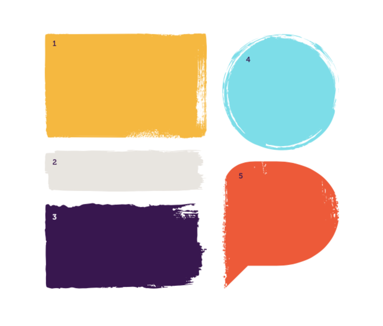
Textures
We have five main textures used as part of our visual identity. These are colour filled shapes that have a hand-drawn brush stroke effect around the edges.
Textures are used mainly as background elements to hold text, iconography and imagery, but can also be placed on top of imagery to hold text.

Brush strokes
Brush strokes

Textures
Textures
Graphics and imagery
Graphic devices used within the branding.

Brush stroke circle
Circle can be used in any of the CIPD brand colours. This circle can be rotated.

Brush stroke cross
Cross can be used in any of the CIPD brand colours. This circle can be rotated.

Brush stroke square
Circle can be used in any of the CIPD brand colours. This circle can be rotated.
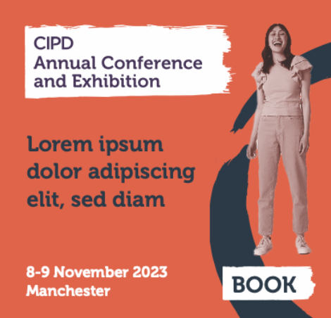
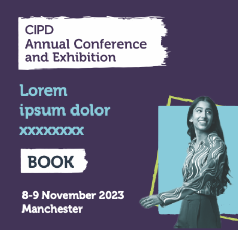
Digital design
Examples of digital advertising
Digital designs for social media and third party digital advertising campaigns.

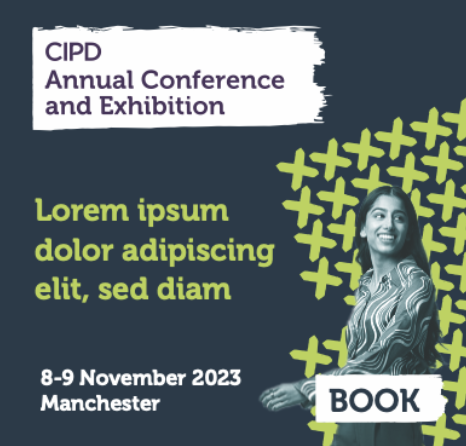


Example MPU | 250x300px


Example email banner | 600x200px
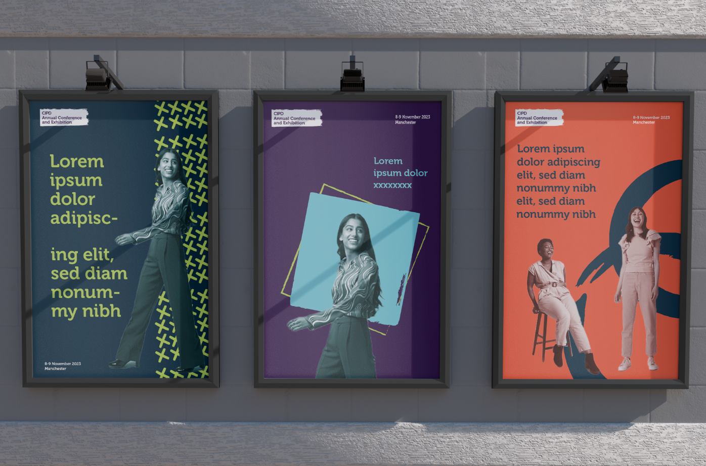
On-site signage & print design
Examples of directional signage


*All assets are owned by Haymarket Media Group and should be used within the CIPD values and brand guidelines.
Key Contacts
Head of Operations | sarah.watson@haymarket.com
Head of Marketing | claudia.laing@haymarket.com
Commercial Director | jade.scaffardi@haymarket.com
Head of Content | hannahcapstick@haymarket.com
Art Editor | kayleigh.pavelin@haymarket.com